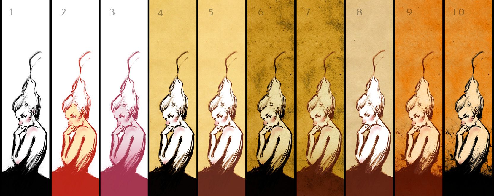
well i'll started out as a simple brush sketch and i wanted to try out different versions... which one do you like? (whenever you see this post ,there is no deadline :))
this is not crazy, i kind of find something in each one..just wanted other opinions..but most people seem to like number 10..or the black inkish ones :)
may be because the modifications are inserted in one image analysis is a must!
let's try..
Each image gives different effect
i DONT like #9 or #10 i can't say why , but i think because of the blothcing that is rising from the dress gives me a feeling of being guilty .. regret
#6 & 7 are distinguished in my opinion , the degradation of the dark color on the background gives a good effect with blushed face and the tip of the arm
Renée wow.. i feel like a genius now haha! very nice analysis, thank you so much for the time and effort.. which mood do you feel you're most related to?
6 & 10...because of the contrast. There's a really nice emotion in the ink work so i say turn up the contrast and let it deliver it's impact. You've got the same energy as Paul Pope going on. Having said all that though. I agree with Basma, all together it makes great food for thought.
renée well i'm not that sick hahaha! but i might use your theory and add my own theories to just know what's more appealing you can choose what connects with you or what you crave to be like..there's a huge difference :) thanks again!
the mattman hey thanks a bunch man, i'll try this contrast thing with another sketch i guess.. i'd be happy to know what you think.. and paul pope? ..well thanks haha..i've only read his 100% and took a look at one issue of THB but that was a long time ago..i must say i love his work but haven't seen much of it printed.. anyway..this "energy" as you say is not so appealing to many people haha..the loosely strokes must get more appreciated..right! thank you again :)
well... first I liked #1 best. then I tried looking at them one by one, and it turned out I liked #10 most, followed by 6 and 7, both which I like in the same extent. As you said, the black inkish ones look better, the only exception is #6 which looks great despite being brownish
you might think this crazy, but i like it just as it is, the whole set packed in one.
ReplyDeletethis is not crazy, i kind of find something in each one..just wanted other opinions..but most people seem to like number 10..or the black inkish ones :)
ReplyDeleteReally I like 7 and 10. Very nice!
ReplyDeleteThis comment has been removed by a blog administrator.
ReplyDeleteHi Hatem :)
ReplyDeleteIt reminds me of the psychological tests! ...
may be because the modifications are inserted in one image analysis is a must!
let's try..
Each image gives different effect
i DONT like #9 or #10 i can't say why , but i think because of the blothcing that is rising from the dress gives me a feeling of being guilty .. regret
#6 & 7 are distinguished in my opinion , the degradation of the dark color on the background gives a good effect with blushed face and the tip of the arm
# 1 , 2 , 3 blanc backgroung .. independance..liberty
# 4 , 5 , 8 a colored background .. responsability .. an invisible anchorage ..
-rOn-
ethe
ReplyDeletethanks a bucket :D!
Renée
wow.. i feel like a genius now haha!
very nice analysis, thank you so much for the time and effort..
which mood do you feel you're most related to?
Hi Hatem :)
ReplyDeleteIf i'd fulfill my dreams i'll choose #1..it says "I'm Here" there's no need for colors ; i'm already known!
But for now , i think #3 fits more the mood
!~...
now it's ur turn to analys your visitor's comments!
6 & 10...because of the contrast. There's a really nice emotion in the ink work so i say turn up the contrast and let it deliver it's impact. You've got the same energy as Paul Pope going on.
ReplyDeleteHaving said all that though. I agree with Basma, all together it makes great food for thought.
renée
ReplyDeletewell i'm not that sick hahaha!
but i might use your theory and add my own theories to just know what's more appealing
you can choose what connects with you or what you crave to be like..there's a huge difference :)
thanks again!
the mattman
hey thanks a bunch man, i'll try this contrast thing with another sketch i guess.. i'd be happy to know what you think..
and paul pope? ..well thanks haha..i've only read his 100% and took a look at one issue of THB but that was a long time ago..i must say i love his work but haven't seen much of it printed..
anyway..this "energy" as you say is not so appealing to many people haha..the loosely strokes must get more appreciated..right!
thank you again :)
well... first I liked #1 best. then I tried looking at them one by one, and it turned out I liked #10 most, followed by 6 and 7, both which I like in the same extent. As you said, the black inkish ones look better, the only exception is #6 which looks great despite being brownish
ReplyDelete